UX Content Strategist
Canada Post – Sign-In Suite Microcopy Overhaul
Challenge
Canada Post’s sign-in experience (prior to 2022) was inconsistent across multiple flows, creating usability issues and raising maintenance and security concerns.
Solution
Unify five sign-in flows into a consistent, secure, and user-friendly experience.
-
User goals: Secure and simplified login
-
Business goals: Easier maintenance and reduced support burden
My role
As the UX writer on the project, I collaborated closely with a visual designer, product owner, and UX director to:
-
Rewrite ~60 screens of microcopy across five distinct flows
-
Align error messages, button labels, tooltips, and helper text
-
Create consistent patterns for field validation and confirmation messages
-
Ensure content met accessibility and compliance standards
Approach
-
Prototyped revised copy across 3 sprints (~6 weeks)
-
Iterated weekly based on team feedback and internal reviews
-
Documented content choices and backlog items for future consideration
Testing
-
Although full metrics weren’t available, the prototype underwent usability testing and NPS collection to inform next steps. Team feedback indicated improved clarity and reduced confusion during testing.
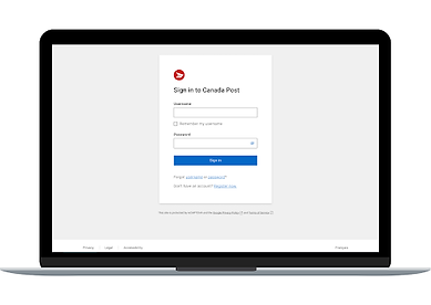
Sample screens (hover for before/after)
The following are samples of content changes based on my recommendations for the new user flow.
Sign in


2FV hasn’t been set up


Boost security


Forgot password


Key learnings
-
Even early-stage content needs ongoing iteration
-
Team collaboration surfaced edge cases earlier
-
Creating component-level guidelines would help with future reuse